Posted at: August 28, 2022
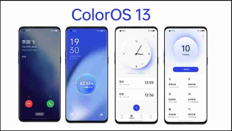
Recently, OPPO has officially introduced ColorOS 13. It is not surprising that this latest user interface of the company is based on Android 13 version.
For those who don’t know, OPPO has changed the naming of the ColorOS version to match the Android version with the launch of ColorOS 11 in 2020. What new features does ColorOS 13 have to improve the user experience? Let’s find out the answer through the article below.
ColorOS 13 has a new design language called “Aquamorphic”. OPPO claims that this design is inspired by water. Despite the impressive name, the interface of the latest version of ColorOS looks similar to ColorOS 12 but comes with a few tweaks to provide a better overall experience.
Specifically, the default color of ColorOS 13 will be blue and convert to different colors depending on the time of day, similar to the way water reflects light. However, the new ColorOS still lacks the system color division feature according to the color palette similar to Material You on Google Pixel, OPPO says that they are still working on these features.
The ColorOS 13 interface follows a card-style layout. Installers and first-party apps come with different sized cards that display information based on the content type. Finally, this user interface features beautiful status illustrations throughout the software, giving it a unique look.
Redesigned Home screen and Control Center
Similar to the main part of ColorOS 13 like ColorOS 12, except users can zoom in on folders. Although it sounds like a simple feature, it is very useful.
That’s because on ColorOS 13, you don’t need to open a folder to access the desired app anymore. All you have to do is simply tap on the icon of the required application present inside the large folder to quickly access it.
Users who don’t like the iOS-style home screen (all apps are outside of the Home Screen) can now opt to use the App Drawer for a cleaner home screen experience.
Most importantly, ColorOS 13 arrives with a redesigned Control Center. The top section has two large toggles on the left and a media playback control widget on the right. By default, the big toggles are WiFi and Bluetooth but the user can change it according to his preference.
The notification area located below the Control Center will be in portrait view. However, in landscape view such as when users watch videos or play games, the notification drawer shifts to the right, while the Control Center remains on the left. This makes it easy to access quick toggles and respond to notifications.
Always On Display
OPPO’s ColorOS UI has always been famous for its implementation of the Always On Display (AOD) feature. With ColorOS 13, this feature gets even better with more AOD styles and integration with third-party apps.
Accordingly, OPPO has introduced a new series of AOD styles called “Home”. It introduces how the earth is affected by global warming. Users can choose from three styles including polar bear, penguin, and coral with clownfish.
Speaking of third-party apps, OPPO has partnered with Spotify and Indian food delivery companies Zomato and Swiggy to always display information on the lock screen. Applications provided by these companies will be displayed on AOD.
Accordingly, Spotify AOD will display the currently playing music along with the controls and icons of the four most played playlists. On the other hand, the India-exclusive Zomato and Swiggy AOD will display useful information such as “Order Accepted”, “Item Received”, “Distance to Destination” and “Delivered”.
PC connection is easy and fast.
OPPO introduced PC Connect with ColorOS 12. Currently, there are no new changes in the beta of ColorOS 13, but the Chinese company has revealed plans to add more features in the later releases of the interface. this new user interface.
OPPO says that it will add functions such as answering calls and sending/receiving messages on computers. In other words, PC Connect will become part of Microsoft Phone Link instead of just mirroring the screen.
Therefore, in addition to the new features coming soon, users can also use existing features such as notification sync, clipboard sync, and file transfer.
With more such improvements, PC Connect promises to bring a better user experience, no less than Huawei Multi Screen Collaboration and Samsung DeX.
Kid Space – Children’s safe space
ColorOS 13 brings a lot of improvements to the Kid Space feature, a safe space for kids. ColorOS 13 now has the ability to take advantage of the phone sensor to warn children when using the phone in too low light, adjust the sitting posture, the distance from the eye to the screen to be the most scientific.
